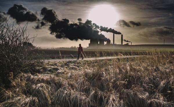
The Guardian recently published 10 charts explaining climate change. These visualizations portray various factors and effects contributing to this unprecedented crisis along with potential solutions. The first chart visualizes the level of CO2 in the atmosphere, which is now the highest it has been in 4 million years. Edging us into uncharted territory, this is the result of years of burning coal, oil, and gas. Another chart plots deforestation, a major contributor to this unprecedented rise along with the beginning of a sixth mass extinction. The planet’s global average temperature is also visualized, which has steadily risen over the last two centuries and has seen a major spike since the Second World War. The next set of charts plot the loss of sea ice, rising sea levels, and an increase in major weather events. However, there has also been a rise in solar and wind power and an uptick in electric vehicle use. The cost of lithium-ion batteries, that are needed for renewable energy, has also dropped.

- Log in to post comments


CRC Comments