September 3rd, 2013
The figure below displays per capita trends in Canadian produce supply and waste over the last 50 years. The total supply of food per person has increased from the early 1960s to today. However, the graph shows that these increases correlate to the rising numbers of imported food items, whereas our local production has more or less remained the same since the early 1960s (in terms of per capita values). In addition, you can see that food wastage has also steadily increased over the last 50 years, and thus the increased food supply does not necessarily mean everyone is getting more to eat. The food supply in Canada has increased, but so has waste and reliance on imported foods; therefore, more food does not mean more food security.
The most recent Hunger Count report from Food Bank Canada reveals a dramatic increase in use of food bank services in recent years (i.e., 31% increase from 2008 to 2012). We are seeing a growing need for food security in Canada, but, through local community innovations, there are many options. Last week, the Good Society blog looked at an initiative in Ottawa, the Hope Garden, a volunteer-driven project that produces vegetable and herbs through urban garden space for the Shepherds of Good Hope soup kitchen. Projects such as the Hope Garden increase community vitality in many ways. First, by increasing local food production; second, increasing local resiliency; third building social capital; and lastly developing and maintaining multi-functional green spaces. In addition, these green spaces also can have greenhouse gas mitigation effects. Incredible Edible is another project worth exploring.
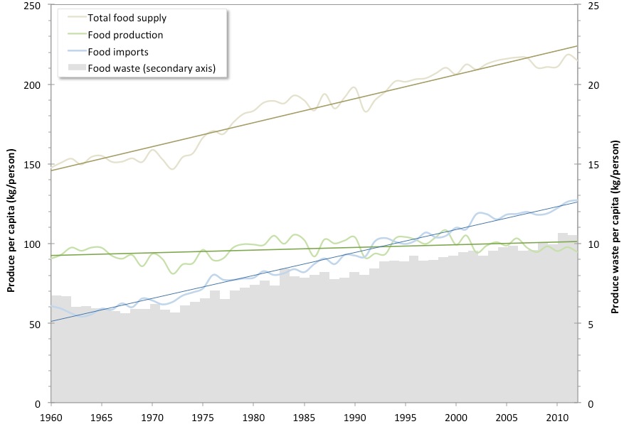
Data used to construct the above graph was obtained from Statistics Canada. Flucturating lines represent plots of yearly values, and straight lines represent their respective regressions. Food waste trends are plotted in grey (using bar graphs) and on the secondary (right) y-axis.
- Log in to post comments


CRC Comments