It’s no secret that scientists struggle to communicate their imperative research to the public. Climate change science, in particular, poses additional challenges as many people become apathetic or depressed when it comes to this environmental threat. But a recent trend in communicating research through data visualizations may help change this. After the monumental success of Ed Hawkins’ viral global temperature gif, more and more seem to be popping up. Researchers from the University of Washington and The Nature Conservancy recently released Migrations in Motion, a beautifully designed map that animates research from their 2013 study. It illustrates the average direction that 2,903 species of mammals, birds, and amphibians may need to migrate to as a result of climate change. While animals have moved to new habitats in the past, human development may block their pathways. Fortunately, there are many steps that conservationists and land managers can take to help them along their journeys—such as removing fencing, adding wildlife overpasses to major roadways, and improving infrastructure routes to help reconnect fragmented areas.
Check out our recent publication, “A picture is worth a thousand data points: Exploring visualizations as tools for connecting the public to climate change research”, to learn more about data visualizations.
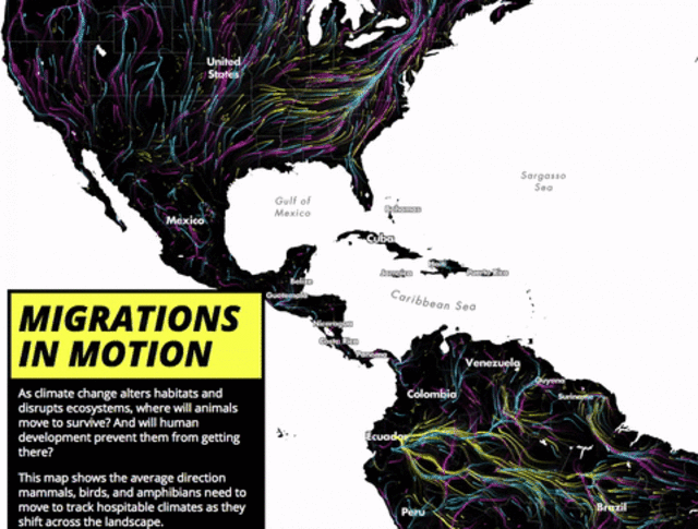
Migrations in Motion, image via Fast Co.Exist. See full interactive map here, including Canada.
- Log in to post comments


CRC Comments